Easily access payroll information for every country where you operate. From HR compliance to tax deductions and filings, our guides provide insights that can help you to manage payroll across borders.
Confused by HR & Payroll jargon? Our glossary makes it simple. Quickly look up key HR and Payroll terms, understand complex concepts, and stay confident when managing payroll across different countries.
Leuk dat je deze pagina hebt geopend! Hier vind je de belangrijkste elementen die je nodig hebt om onze merkidentiteit toe te passen in je communicatie.
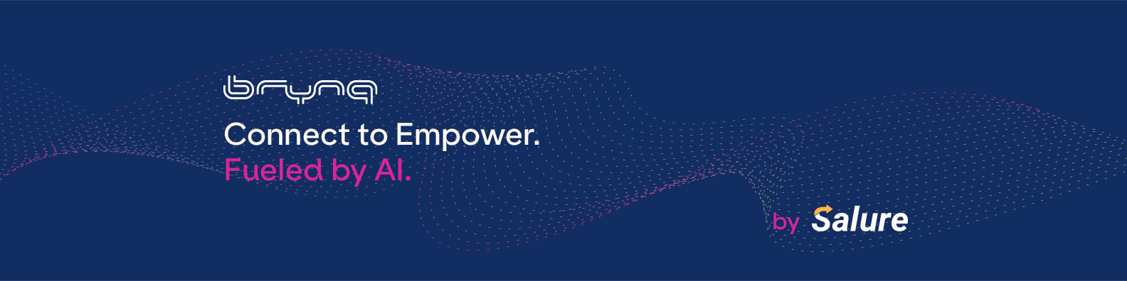
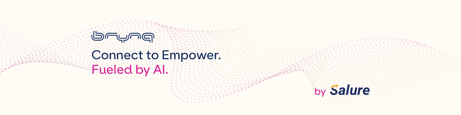
Logo
Daarnaast vind je het meest gebruikte BrynQ logo: een PNG met een transparante achtergrond. Klik erop om te downloaden.
Heb je een andere versie nodig? Neem contact op met het marketingteam.
Lettertypen
Consistente typografie is essentieel voor een samenhangende look. Hier vind je de lettertypes die we gebruiken en hoe je ze toepast.
ES Klarheit Kurrent - Koers
Bai Jamjuree Vet - Subkop H2
Bai Jamjuree Medium - Onderverdeling H3
Ruda - Tekst
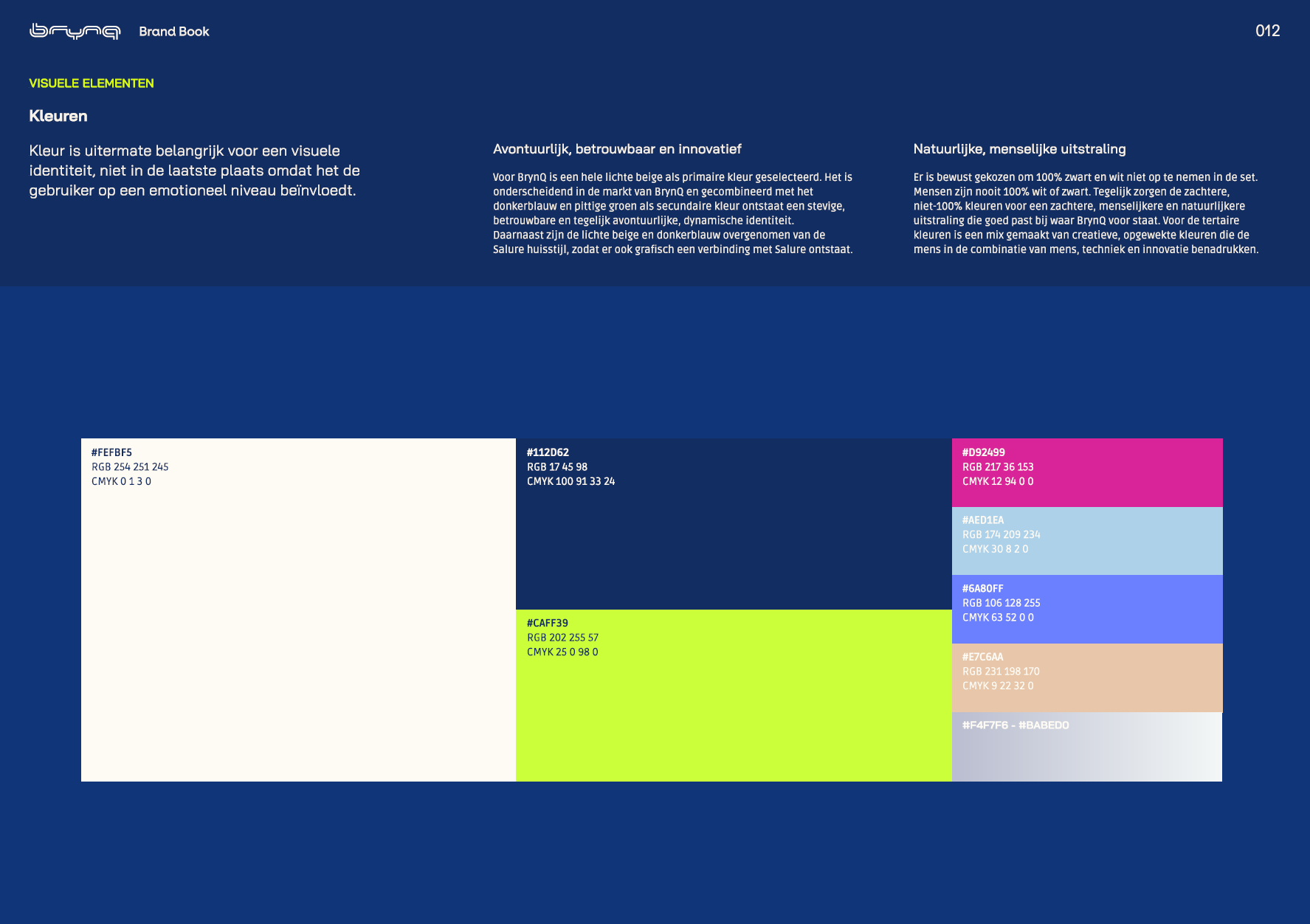
Kleuren
De primaire kleur voor BrynQ is licht beige. Daarnaast zijn blauw en groen de twee kleuren die je ook vaak zult zien.
Daarnaast zijn er verschillende ondersteunende kleuren die in mindere mate kunnen worden toegepast, die je kunt vinden in de grafiek rechts.
Beige #FEFBF5
Blauw #112D62
Groen #CAFF39
LinkedIn
Wil je de header van je LinkedIn profiel updaten? Klik op een van de afbeeldingen links en voeg er een toe.
Word-sjabloon
Richtlijnen voor leesbare brochureteksten:
Vermijd lange, complexe zinnen. Splits ze indien mogelijk.
Vermijd passieve zinsconstructies.
Spreek de lezer rechtstreeks aan.
Wees duidelijk en to the point.
Sjabloon
Open de sjabloon hieronder. Je zou vanaf hier een nieuw Word-document moeten kunnen starten. Laat Marketing weten als je problemen ondervindt.


